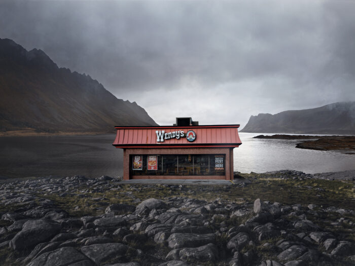
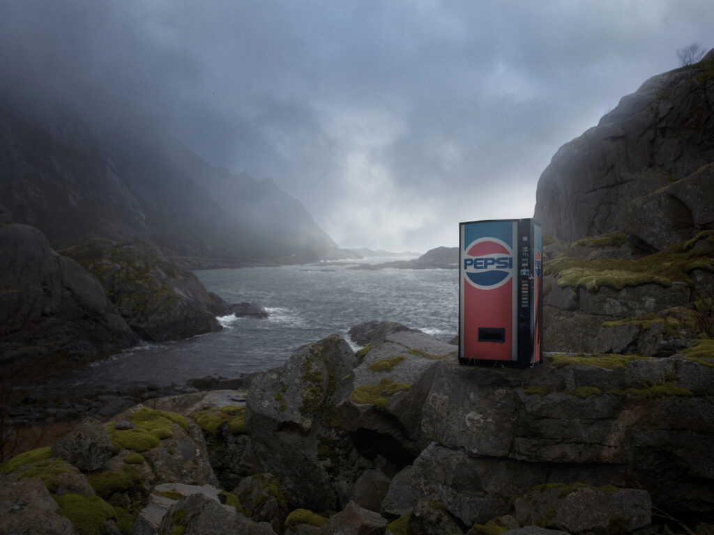
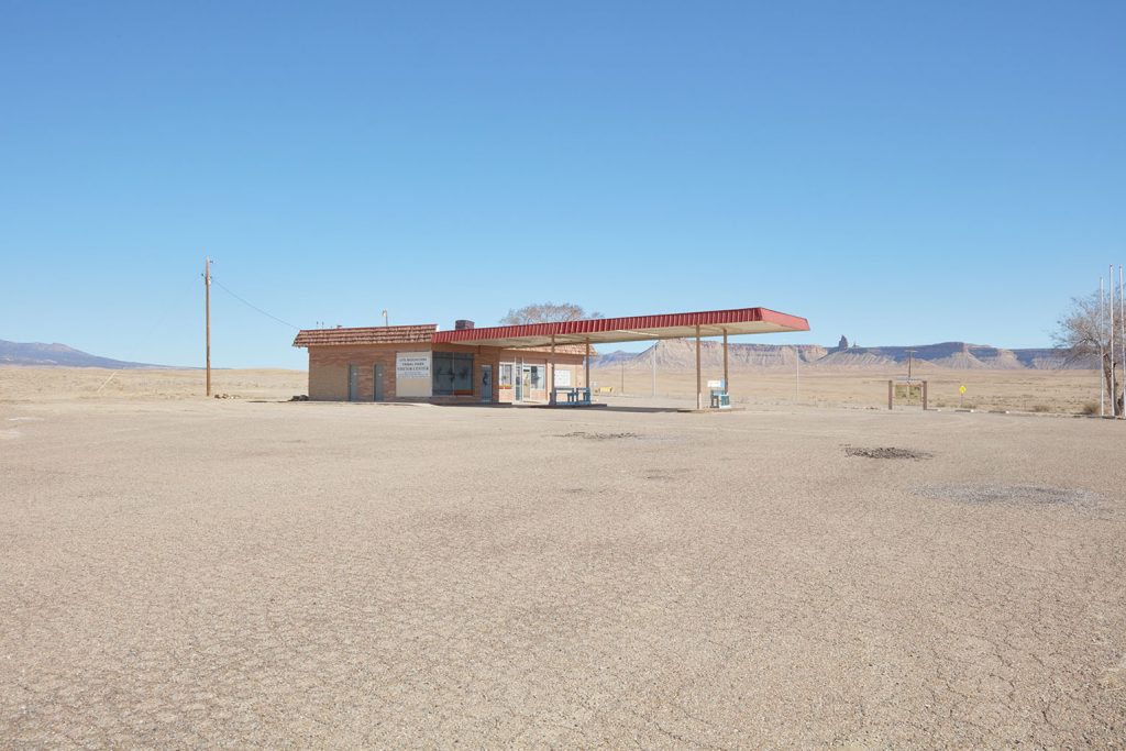
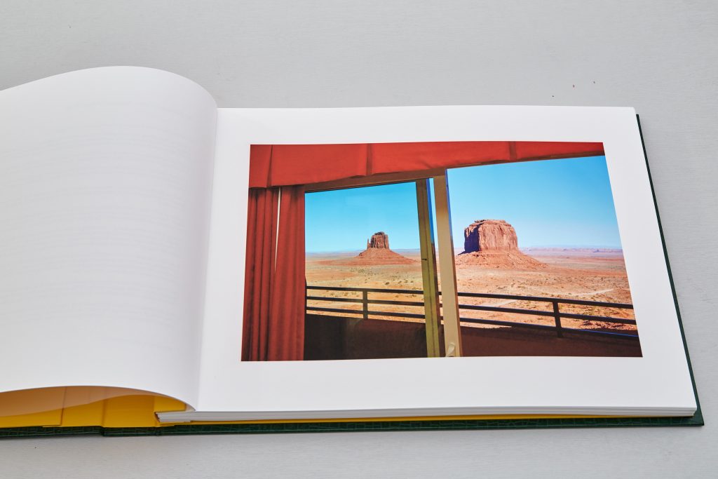
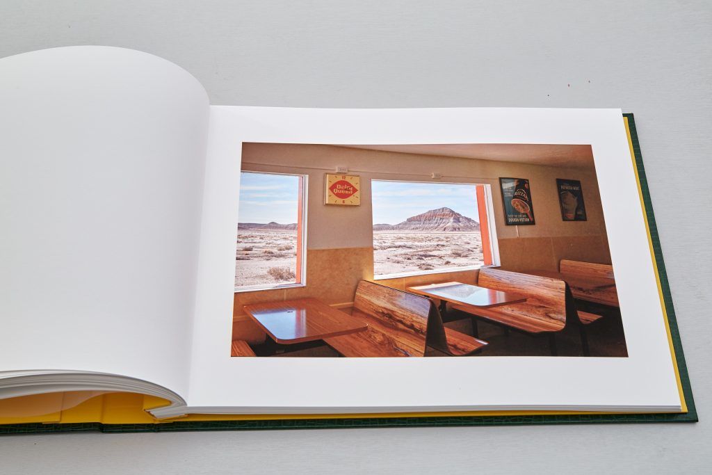
Fast Food is an extension to Brents Inbetween Places project
exploring how land and geography is increasingly used as the anchor point of
political and social discourse intended to exclude others from what is ‘ours’.
Ironically much has become homogenised, one place looking
very much as another, global
corporations create a mono culture, fast food chains are so ubiquitous we no
longer even notice their form, the brands making little effort to blend in the
locations they occupy or reflect the local culture.
Brent decided to develop his own fast food sites, the
locations are real, does the addition of
the vending machine, burger joint or restaurant even look out of place, do we
even think to question their validity?
by brentpix
|
Comments Off on One Mississippi Alec Soth
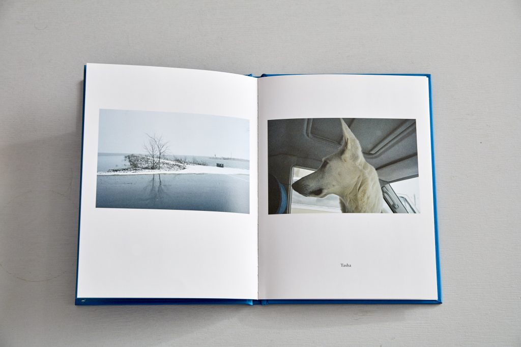
A personal favourite, a tiny but very lovely little book of images from the early days career of Alec Soth. One Mississippi, part of the Nazraeli PressOne Picture Book series.
One Mississippi Alec Soth Nazraeli Press 2010
16 pages hardback cover book, full colour images with original C type print included, signed on verso. The book is only 8.4 × 12 cm! and there are only 11 full colour images plus the print. I love it because it is so simple although very expensive at $250 on release. What I didnt like about it in context of my project and why it wouldnt have worked for me is its most endearing feature, ie its size. My images I fear would not have worked being so small but I absolutely loved the idea of including the original C type which of course is why its so expensive. Books that include an original print have always been desirable and this is something Ive took on board for sure when I decided to make all the pages in the book archival rag prints.
References:
Soth A, 2010, One Mississippi, Nazraeli Press. Ist ed, 11 plates, 1 c type
by brentpix
|
Comments Off on Revisiting my Practice
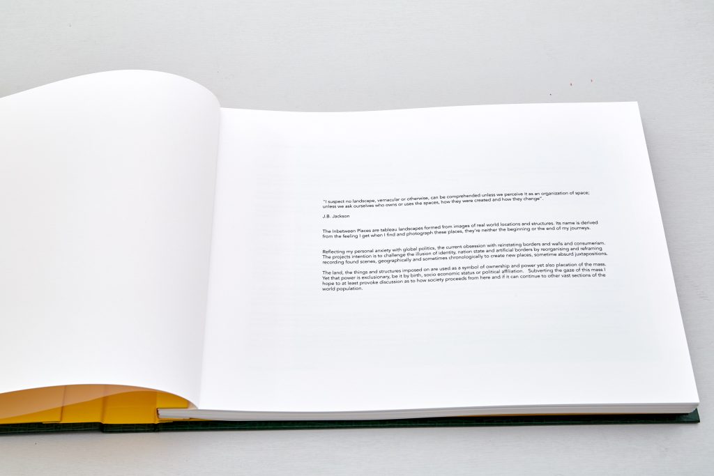
“I suspect no landscape, vernacular or otherwise, can be comprehended unless we perceive it as an organization of space; unless we ask ourselves who owns or uses the spaces, how they were created and how they change. J.B. Jackson
Ive used this quote a few times throughout the course, not because I think it looks good but because it genuinely resonates with me and chimes with my project exactly.
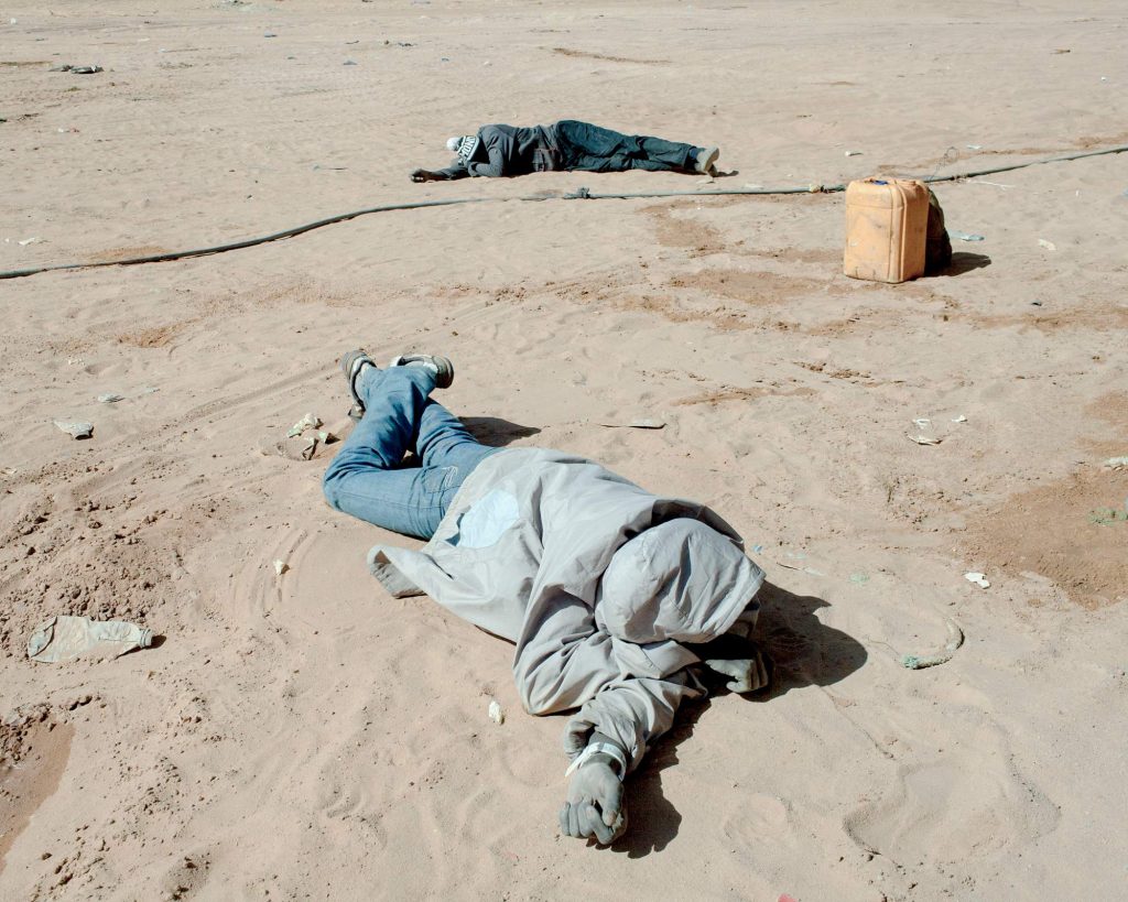
As I have careered around the boundaries, often way beyond in retrospect, of my project Ive found it essential to revisit my practice and what I think it is more often than I ever felt I would. I knew my practice revolves around humanity. This was a conclusion thats slowly dawned on me and became clearer, my time in hospital although on the face of it was a great time to be able to devote thought and gain clarity did nothing of the sort and my anxiety led me down many dark paths that I almost regret.
Associated Press, deceased migrants Libya
When the images you work with look like the above you know that your mind has travelled into much darker spaces and had I not been in such a precarious state with my own health I doubted I would have gone there. However maybe you have to go there to be able to come back better informed.
I used to think I shot many different subjects which is true to an extent but looking at them with a more informed eye I can now see it was always he human element that is the consistent feature. Landscape in particular there will be inevitable traces of human activity in one way or another.
Brent M , 2018 South Beach Miami.
Taking take the privilege of the unseen observer, the image of the beach above I suppose could be considered voyeuristic but I wasnt hiding via use of long lens or digital technology, i’m using a standard lens and stood in plain site but unseen to the subjects as they are very absorbed in their ‘photo session’ continued for a good ten minutes, were the poses a tacit invitation for all to record? So my gaze falls on the world where humans inhabit or have made their inevitable marks.
Thus my view on the world is influenced by the changes humans have made to it, I rarely if ever photograph purely natural things.
My own ‘style’ or ‘look’ I would describe as observational. Im looking for themes, often making comments that I hope my audience will spot and investigate further. I do use compositional rules to help the viewer find their way around the images. In many cases following my directions will lead to a questioning of what it is exactly the viewer is looking at and my theme or comment that may not have been immediately obvious to them might merge.
“Photographs of a Man-Altered Landscape” was how Jenkins had identified in the work of US photographers Robert Adams, Lewis Baltz, Bernd and Hilla Becher (hurrah, a woman!), Joe Deal, Frank Gohlke, Nicholas Nixon, John Schott, Stephen Shore, and Henry Wessel, Jr. This is very much what I am also concerned with, the man altered landscape.
Sean O’Hagen in his piece in the Guardian, New Topographics: Photographs that find beauty in the banal observes
Brent M, 2020 Las Vegas NM
“Only one photographer, Shore, shot in colour. It seemed to heighten the sense of detachment in his photographs of anonymous intersections and streets. Shore was influenced by Ed Ruscha, the conceptualist of Californian cool, who, in the 60s, had made a series of artist’s books with self-explanatory titles such as Twentysix Gasoline Stations, Some Los Angeles Apartments, Every Building on the Sunset Strip. The show also nodded obliquely at the later work of Walker Evans, who had photographed the vernacular iconography of America in road signs, billboards, motels and shop fronts”
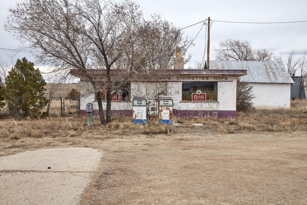
Although I also choose to photograph the vernacular and banal, I do not pursue my subjects in the same way as Ruscha shot his gas stations, he shot them as they were. A “they are what they are” approach. See my post last week about Ruscha. I choose my subjects with a point in mind. The image above, shot near Hisperia CA is the a gigantic recently cleared plot on the new edge of town. Clearly Main Street isn’t what it was. Maybe this phase is transient but the collapse of small town America is no secret and I fear the lot will remain as it is.
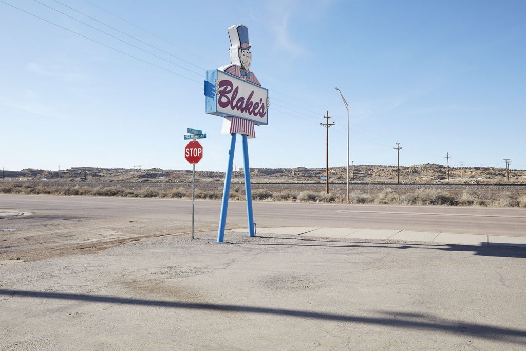
Brent M, 2020 , Gallup NM
Andy Grundberg has noted,
“For all its virtues in making us engage photographs more closely and complexly, the aesthetic of the equivalent…has one major shortcoming: after asserting that an apparently transparent image of the world is imbued with individual vision or feeling, it has difficulty defining what that vision or feeling is. Used as a critical instrument, the theory of equivalence is unable to determine any intended meaning in a photograph. But as a credo, it has served as the dominant aesthetic of American photographic modernist practice.”
As a photographer whose practice has evolved without the benefit of an arts based education or any real appreciation of the world of art photography until quite recently in real terms every discovery sheds new light on my practice and its incredibally exciting to discover what motivated Shore, Balts, Adams etc also motivated me before I was formally aware of their work beyond a superficial level and certainly their motivations for producing it.
To me it proves that the need to record, make sense of the world around us, the landscape according to your vision is an inbuilt trait, an obsession or need that we have to express.
Jenkins speaking of the photographers in New Topographics claims that although their photographs convey “substantial amounts of visual information,” they are, above all, aesthetic arrangements resisting interpretation. He quotes Robert Adams:
“By Interstate 70: a dog skeleton, a vacuum cleaner, TV dinners, a doll, a pie, rolls of carpet…Later, next to the South Platte River: algae, broken concrete, jet contrails, the smell of crude oil…What I hope to document, though not at the expense of surface detail, is the Form that underlines this apparent chaos”.
Deborah Bright says “If we are to make photographs that raise questions or make statements about what is both in and around the picture, we must first become more conscious of the ideological assumptions that structure our approaches”. This interests me and resonates, my first aim when embarking upon this MA was to understand my own practice and then be able to articulate that vision. Also as part of my journey and evolving desire to create works for gallery display this next statement concerns me.
“As part of this, we need to examine the restrictive terms of the art museum and gallery nexus and ask ourselves whether we need to seek out other markets and audiences for our work”
This is something I never really considered, as I make my own art, playing by my rules and personal motivations will it ‘fit’ into the gallery nexus, will I need to discover my own outlet?
As Lewis Baltz says “The landscape…seems more a set of conditions, a location where things and events might transpire rather than a given thing or event in itself; an arena or circumstance within which an open set of possibilities might be induced to play themselves out”
References:
J.B. Jackson, “Concluding with Landscape,” Discovering the Vernacular Landscape (New Haven: Yale University Press, 1984), p. 150.
D Bright Of Mother Nature and Marlboro Men An Inquiry Into the Cultural Meanings of Landscape Photography
by brentpix
|
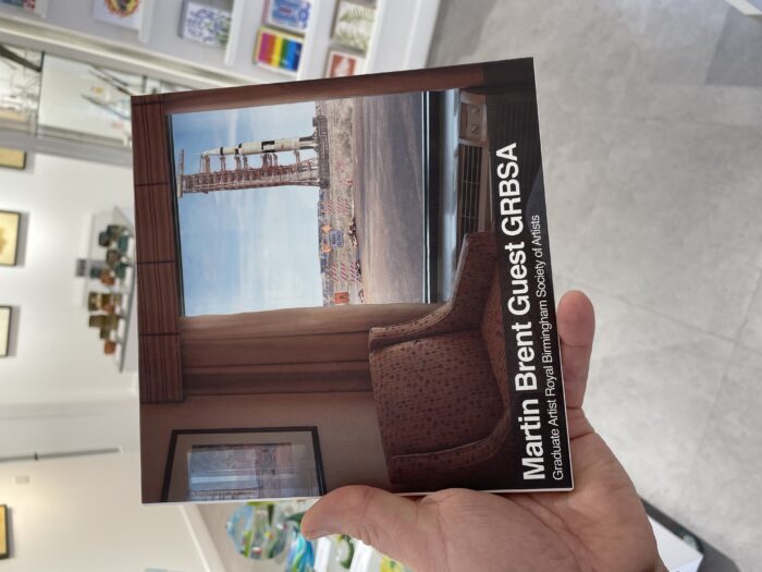
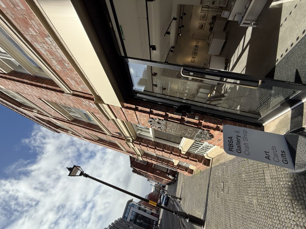
Comments Off on RBSA Graduate Membership
Absolutely thrilled to be selected for the Royal Birmingham Society Of Artists Graduate programme!
This really is a great honour and an important step on my journey as an artist, separating my commercial and personal practice has always been a struggle internally for me, being recognised as an artsist in my own right, not just an ad photographer with a few nice personal pieces I realised was very important to me, also another reason why I chose to use my full name, Martin Brent Guest in my personal practice.
The history of the RBSA dates back to 1821 when the Royal Birmingham Society of Artists was formed as the Birmingham Society of Artists.
In 1868 the Birmingham Society of Artists received its royal charter and was given official consent to use the term “royal” in its title. The RBSA remained in this original building until the site was redeveloped in 1912, after which the Gallery, much reduced in size, was housed in what is now the Medicine Bakery on New Street. The Society moved the Gallery to its current location on St Paul’s Square in 2000 when the new building was opened by the then Prince of Wales, Charles, on 12 April.
Within the RBSA Gallery is held the Society’s permanent collection. This archive comprises over 1000 artworks, catalogues, letters and records documenting the Society’s activities over the past 200+ years. The works of many RBSA Members and Associates, both past and present, are held within the collection, alongside other items important to the history of Birmingham as a city. The RBSA Gallery is, as a result of this important collection, an accredited museum and holds exhibitions showing items from the archive twice a year.
To bepartof a society with such history is amazing, Im so very proud to be included and look forward to contributing to shows and hopefully to the archive.
by brentpix
|
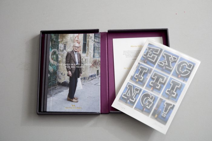
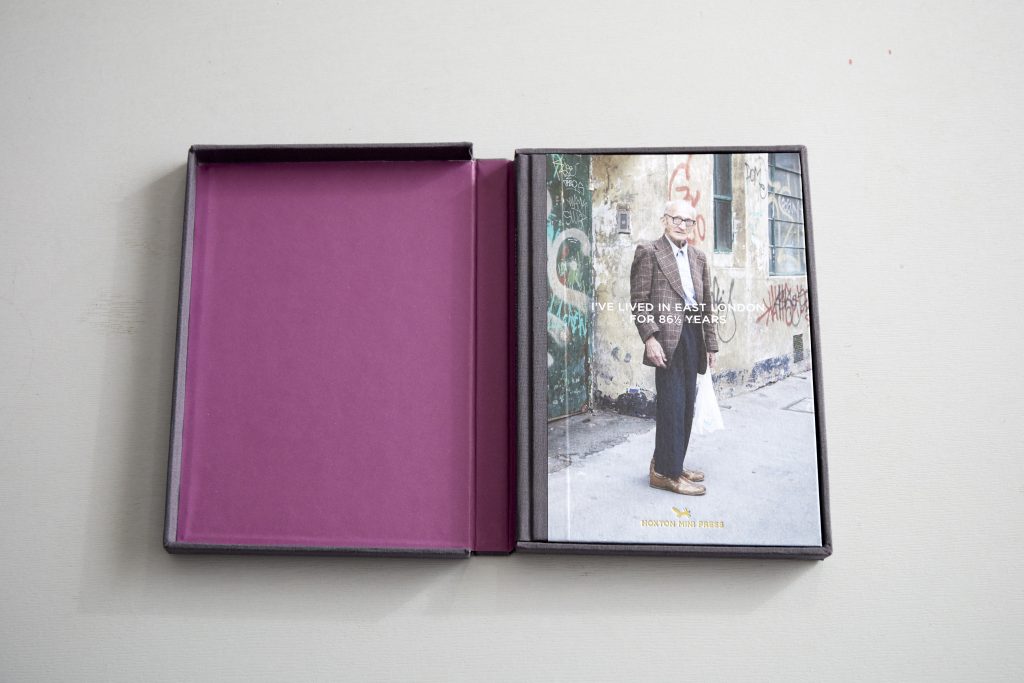
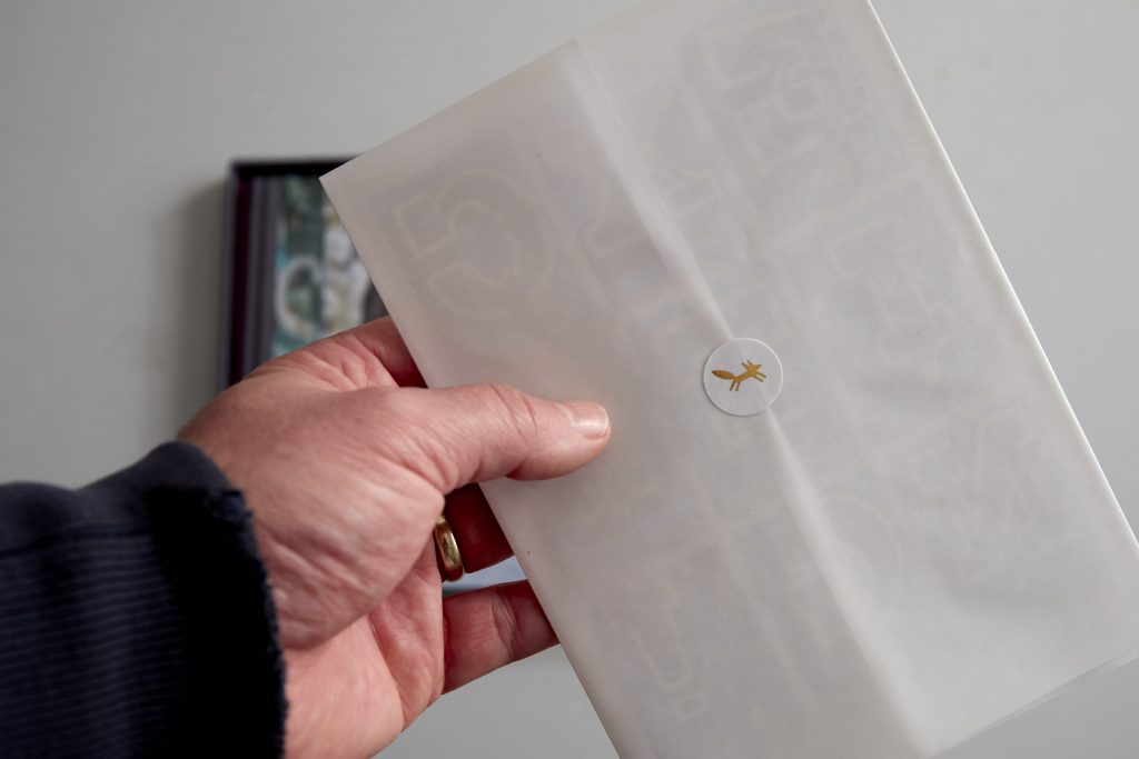
Comments Off on Researching (more) Photobooks
This time I am looking at photobooks that dont follow the usual format of two hard covers and bound internal pages, well not entirely at any rate.
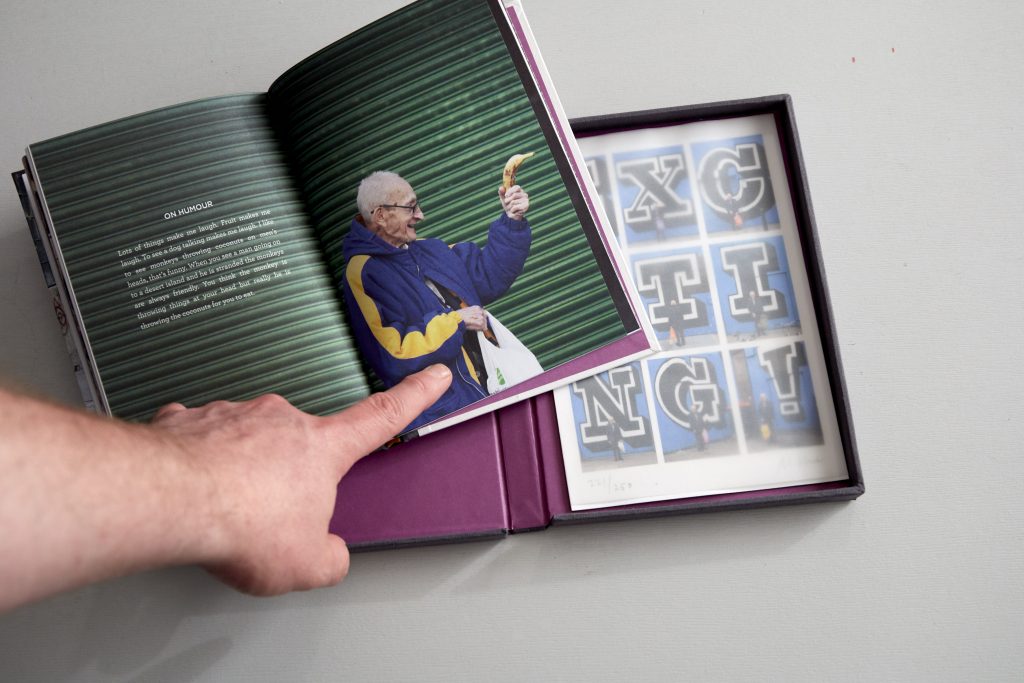
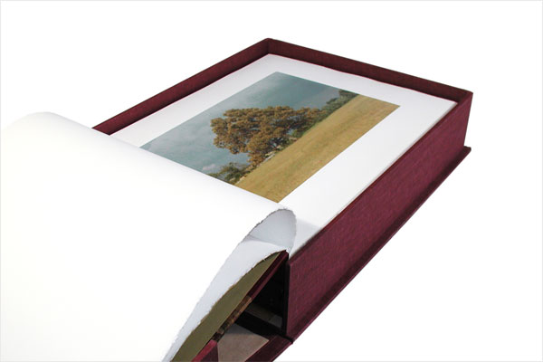
The first is from Hoxton Mini Press and one of their early productions from their collectors series ‘I’ve Lived in East London for 86 ½ Years‘ by Martin Usborne which provides a signed and numbered book with a small edition print contained in a clamshell box. Its all very nicely done, nice colours, nice papers, even a nice opaque wrap with minature fox (Hoxtons trademark) sticker protecting the print. Can you have too much of a good thing? Actually yes in this case because its all so perfect I dont want to unwrap and disturb anything!
Its a really lovely little book and a heart warming and wrenching story about the books protagonist the late Joseph Markovitch. I would like to see more books about folk like Joseph so I am glad this book was made but is the formate suitable for me? Maybe, again the original print ticked my box, this is something I did do and, the clamshell box provides a safe means of delivery but at the size of my eventual production a slipcase proved most suitable.
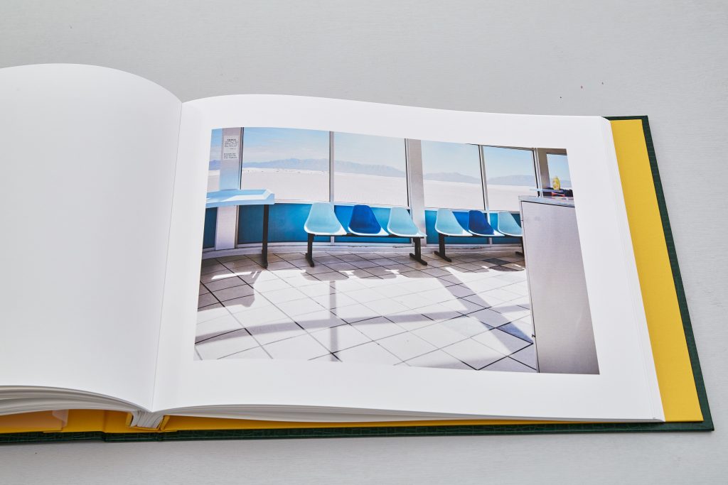
Progress has been made on the public showing of some of the images as mentioned earlier, displayed near or at the places the images partly depict.
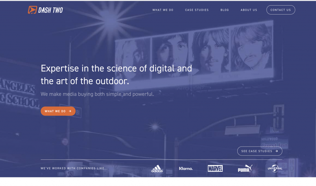
Working with a combination of free poster company Dash Two and
local contacts selected images will be posted on location in the USA
starting March 2021 Covid allowing.
So far we have arrangements in progress for Albuqurque, Tucumcari and Gallop, New Mexico. Cortez, Colorado, Venice and Barstow California.
Some of the placements will be commercial sites others abandoned sites we can use with the assistance of Barstow Area Chamber of Commerce & Visitors Bureau, Tucumcari/Quay County Chamber Of Commerce and The National Indian Youth Council who often work with artists on mural projects.
Dash Two is a company that has evolved from its guerilla freeposting roots, utilising abandoned ad sites and ghost imprints in the 80’s and 90’s who now find and post legitimately on these sites.
Originally planned for March 4th its looking unlikely we will meet this deadline now with Covid continuing to be a major impediment in the US but this isnt a major problem, the images and issues are by their nature timeless.
by brentpix
|
Comments Off on Gallery Representation!
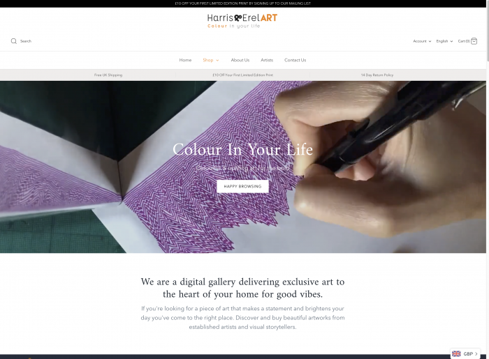
Harris & Erel Art, a high end digital gallery have approached me with
a view to selling The Inbetween Places book and as prints. Although
they have not featured photography previously this look like an
interesting opportunity.
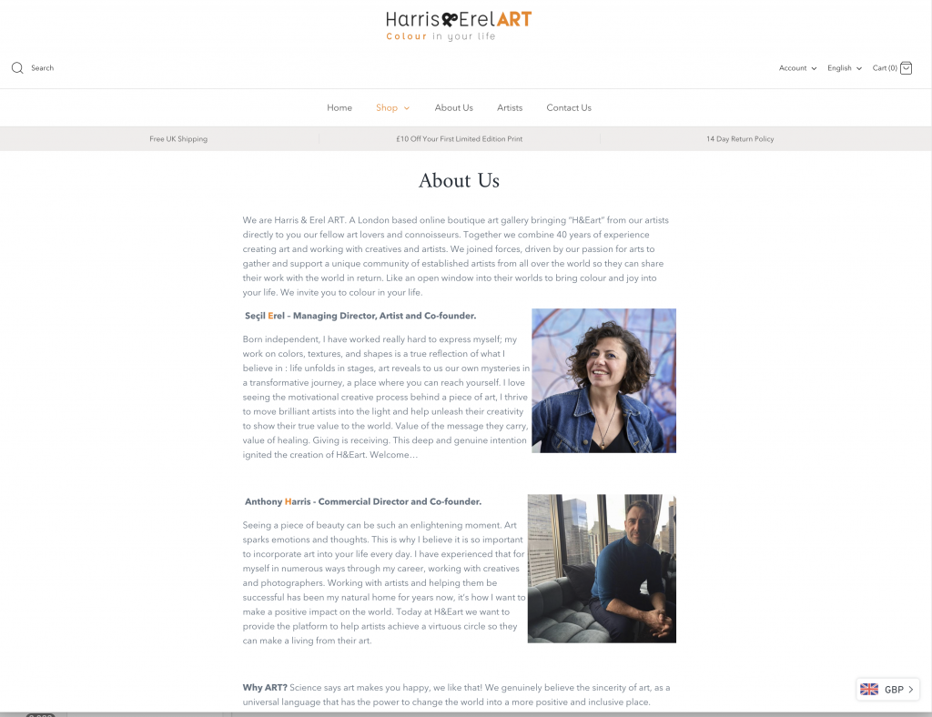
Anthony Harris (ex Getty/Cultura/Imagesource) has been charged with
creating a roster of photographers to grow their sales into this area
both online and via traditional galleries in the future.
The onus is on quality, editioned work and only working with the best. Its early days but this could prove to be a very exciting outcome to the project.
by brentpix
|
Comments Off on Inbetween Places Book Completion
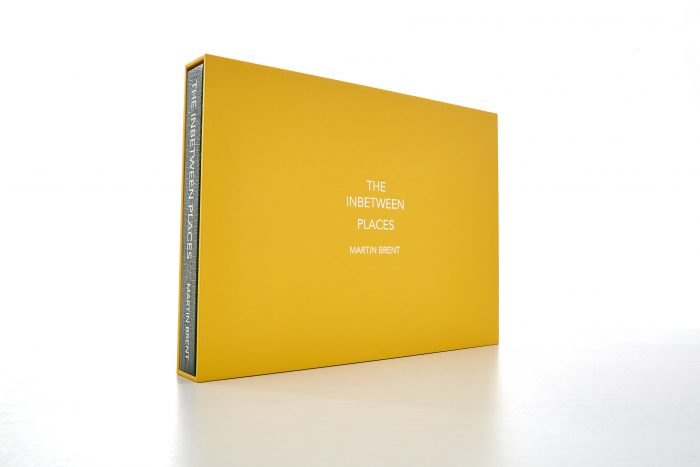
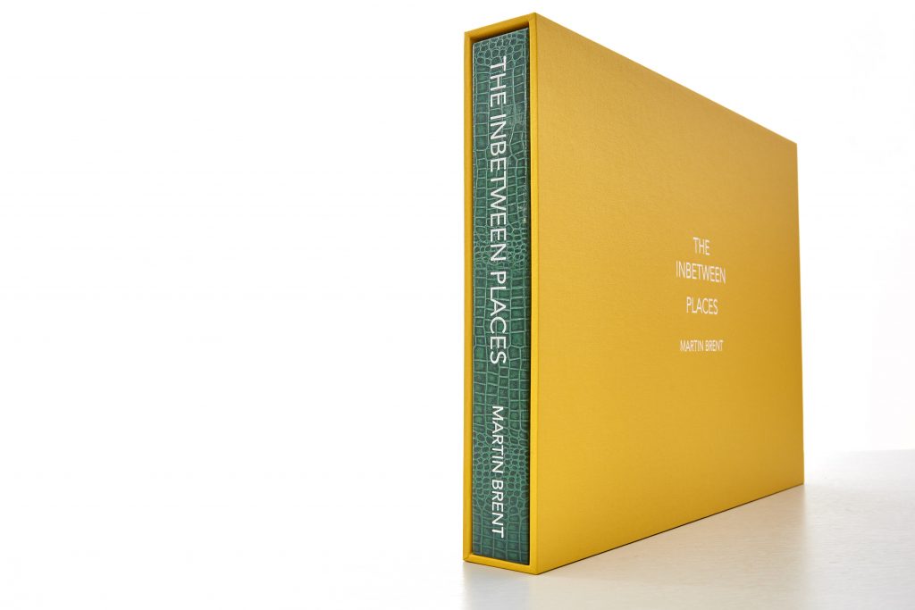
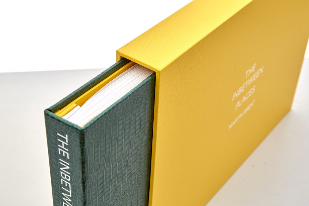
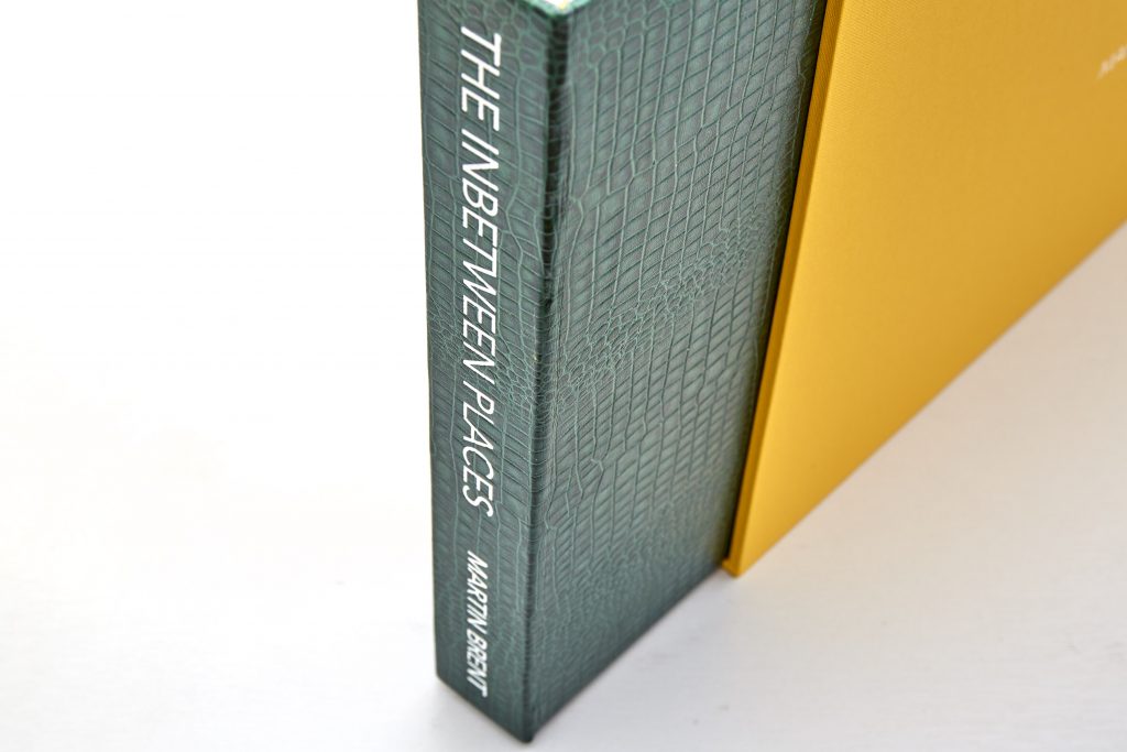
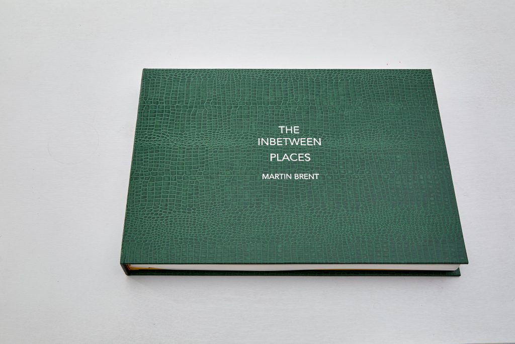
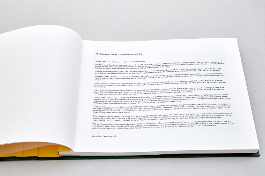
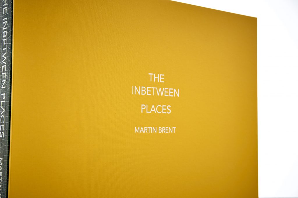
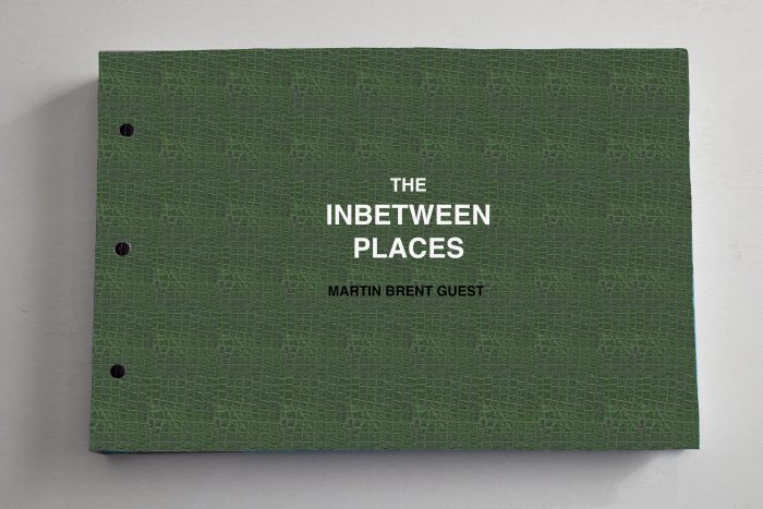
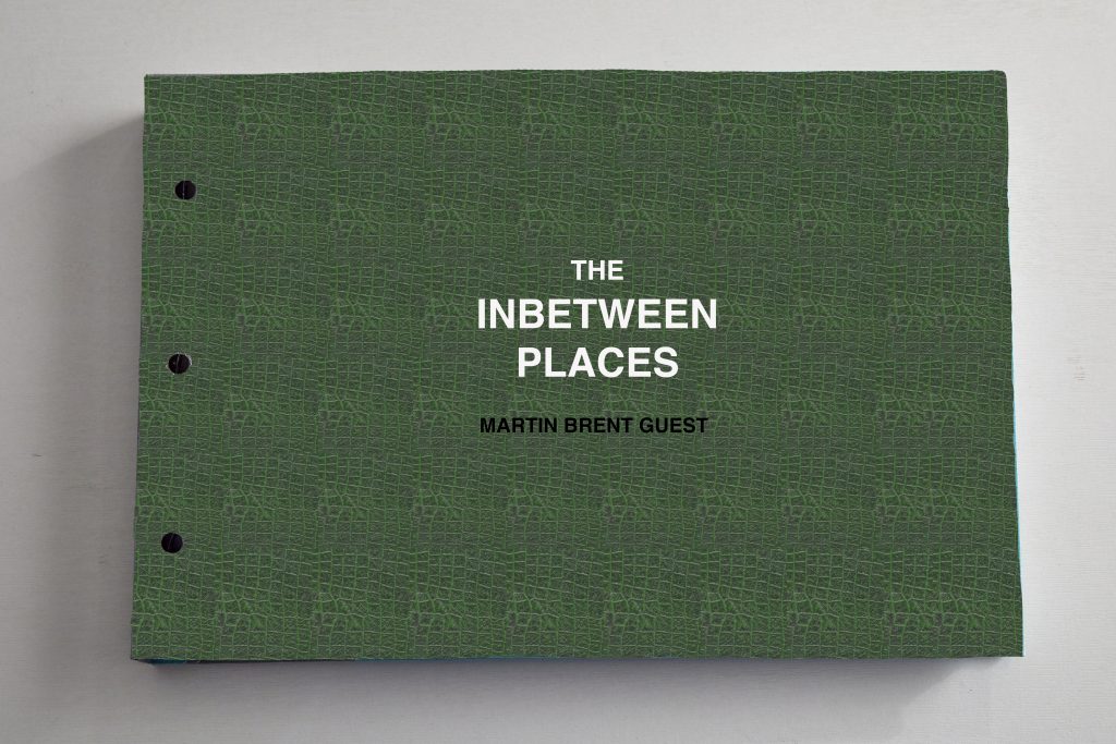
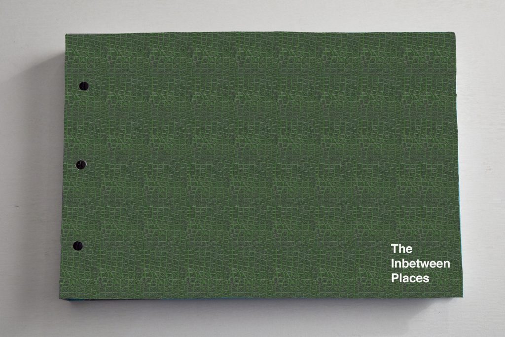
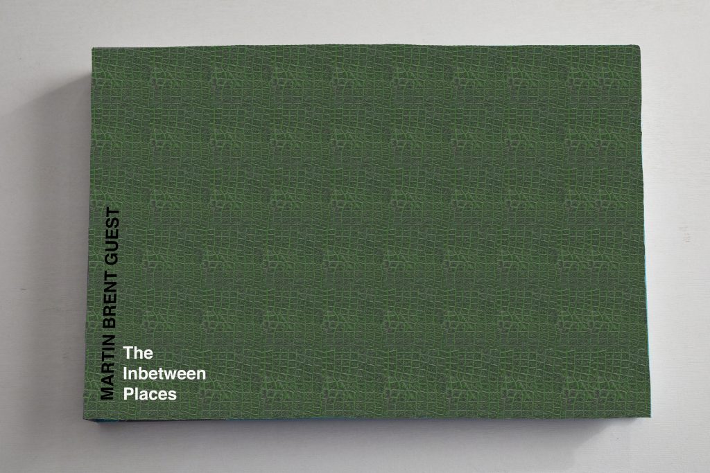
I am absolutely thrilled with the final design of The Inbetween Places Book.
Handmade by Cathy Robert, slipcased and folio bound containing 32
original archival prints. The first edition is limited to 5 signed and
numbered copies. It is published by The Burcot Press and its ISBN
number 978-0-993445-1-4.
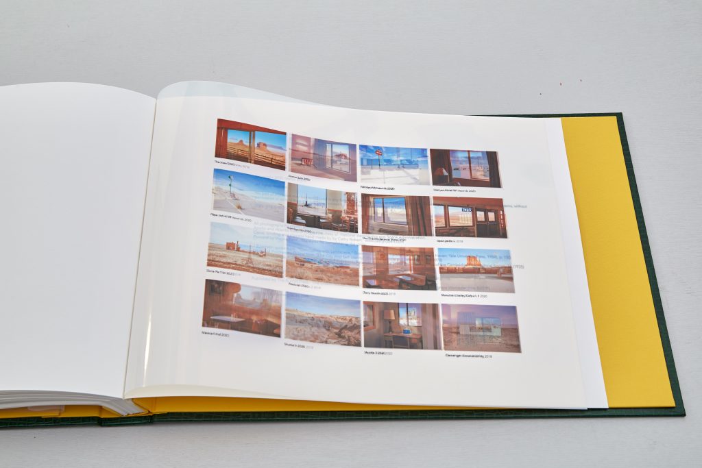
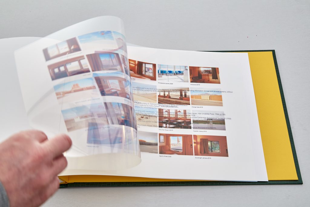
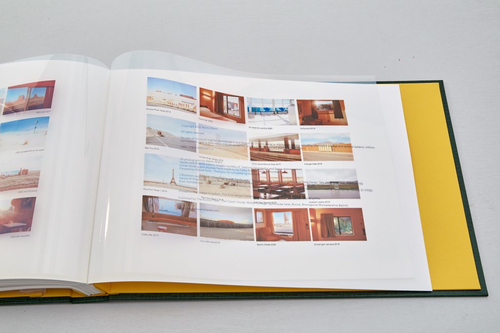
The page size is based on A3, images printed onto Hahnemuhle duo 277 gsm paper. The index prints being printed onto Innova gloss mylar OHP film.
The foreword was written by Wayne Ford, this was the real test of the project, I only gave Wayne the base project description and left it to him to see what he saw in the images. It was actually quite nerve wracking but I was relieved and a little proud to see Wayne had infact picked up on the issues I was attempting to address in the compositions.
Spending a lot of time prior experimenting with different papers and materials really paid off too. I did not want to load up the pages with copy, the intention after all is that the pages be removable for display so elected instead to provide index images, in order, to identify the images and show the correct page order. For this I used a mylar OHP film which was difficult to handle but did print quite well,
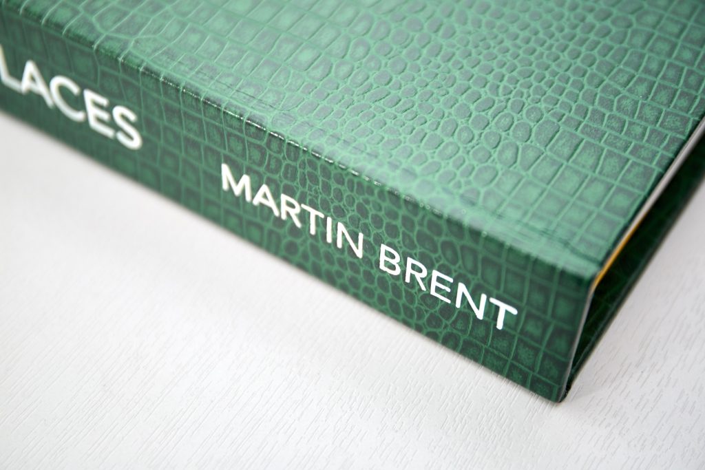
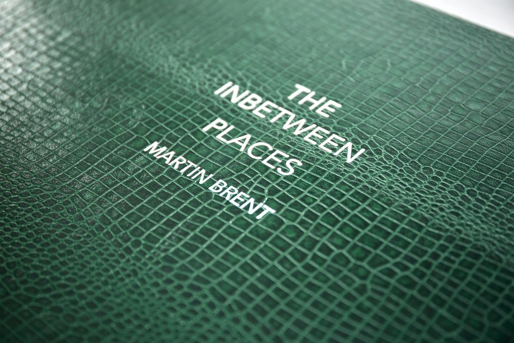
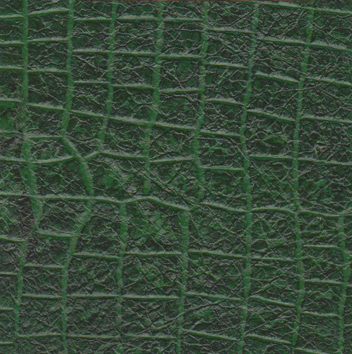
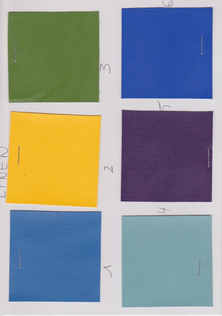
The materials chosen for the cover, a faux green reptile skin and yellow linen for the interior and slipcase trim, really have worked well with the tome in the image, I also had the title and my name embossed into the leather.
So my aim, to be able to produce a large format book, showcasing the images in high resolution and being able to include at least one original print, in this case 32, has been fully met. I have made mistakes though, in retrospect the pages could go a little lighter, the cost was far higher in the end than I anticipated also but some of this was the metal blocking which will be used for future editions. It turns out there isnt a limited supply of the green skin so all 5 first editions may need to be unique.
Overall though I feel the project is a success, I have the book, an exhibition should take place in the US in March 2021 and the social media aspect of the project has been very well received culminating in an offer of gallery representation.
You can view a movie showing the running order of the book here :
Refeences:
All images 2020, Guest Brent M, The Inbetween Places
by brentpix
|
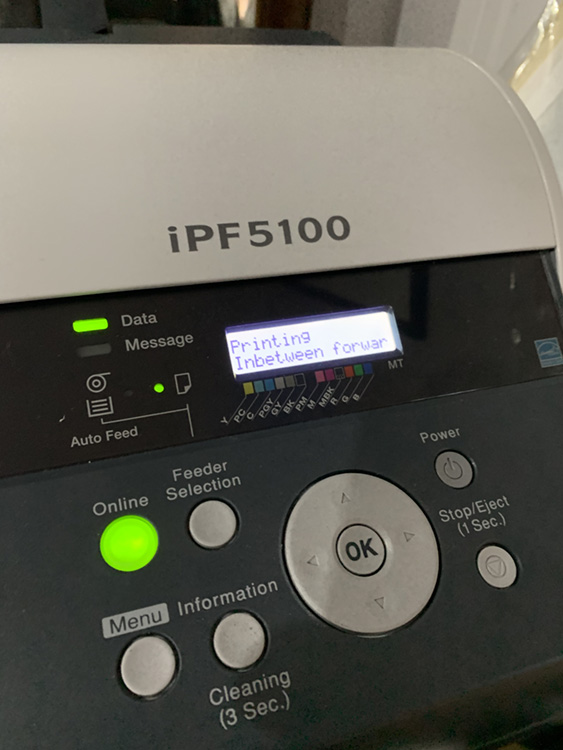
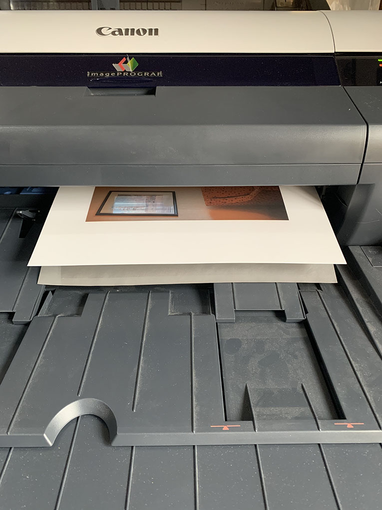
Comments Off on Book Production Begins
Apollo Motel emerges from the printer.
So book production has started in earnest. The final image selection made, a total of 32 final executions plus two index pages. As the intention is to produce a bound folio of actual prints they need to be archival. So I am using Hahnemuhle Photorag Duo for the main pages, its coated on both sides but that wasnt the reason for its choice. At 277 gsm it sits nicely between the single side coated Photorag 308, which is too thick for this application and the 177 gsm which feels a little thin for the image pages.
Images hand printed using Imageprograf 5100. using backing sheet to prevent ink spotting on print verso.
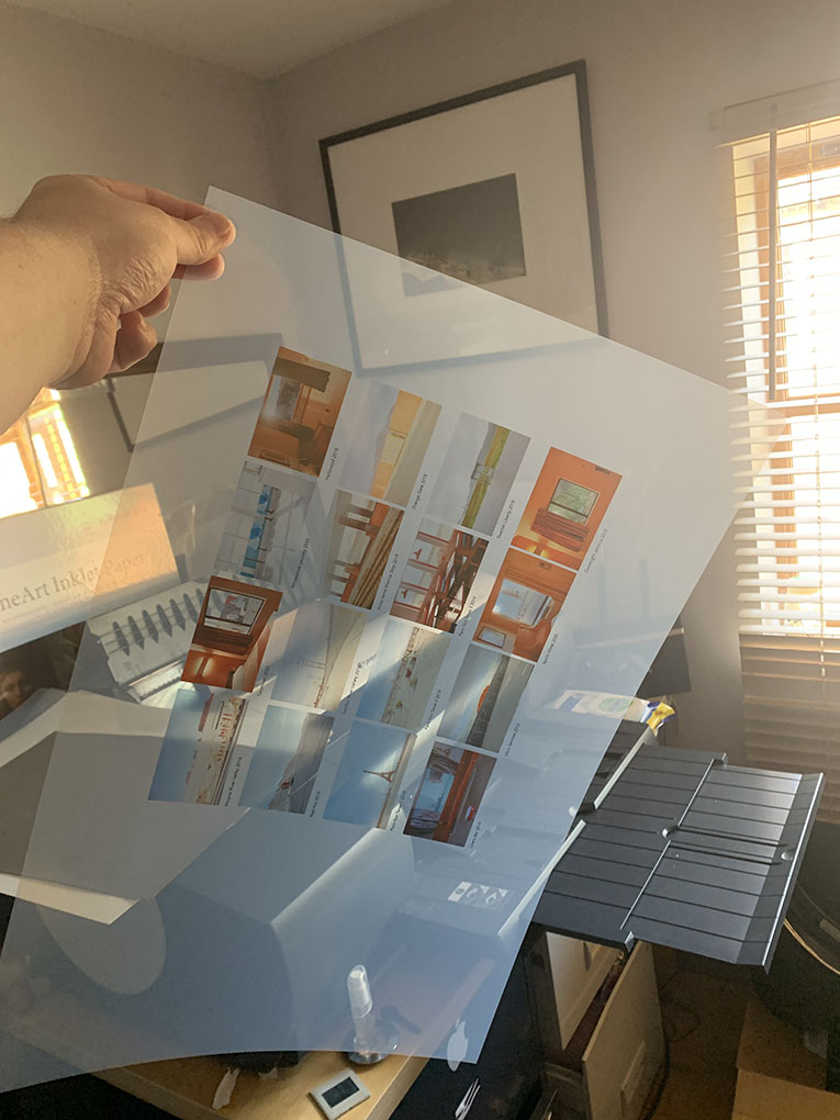
Although I am using the 177 gsm for the intro, forward and credits pages. Its also nice to be able to separate the image pages in this way, it also emphasises the pages are removable.
One of the image index pages showing their translucent quality.
I have chosen a translucent film for the index pages, a material by Innova, not easy to print on and will need cutting down to A3 from its A3+ original but the result is very interesting and at only 174gsm the thickness is a close match to the typeset pages.
Once complete the pages will be taken to Cathy Robert for final binding.
Looking at various options for the book cover I have settled on a slightly crazy faux reptile skin, I like it because at first glance it appears to be quite formal and academic, reminiscent of an old dusty encylopedia but closer inspection reveals the reptile effect which then throws it into a completely different sphere, something a little decadent, something a little Fear & Loathing in Las Vegas even.
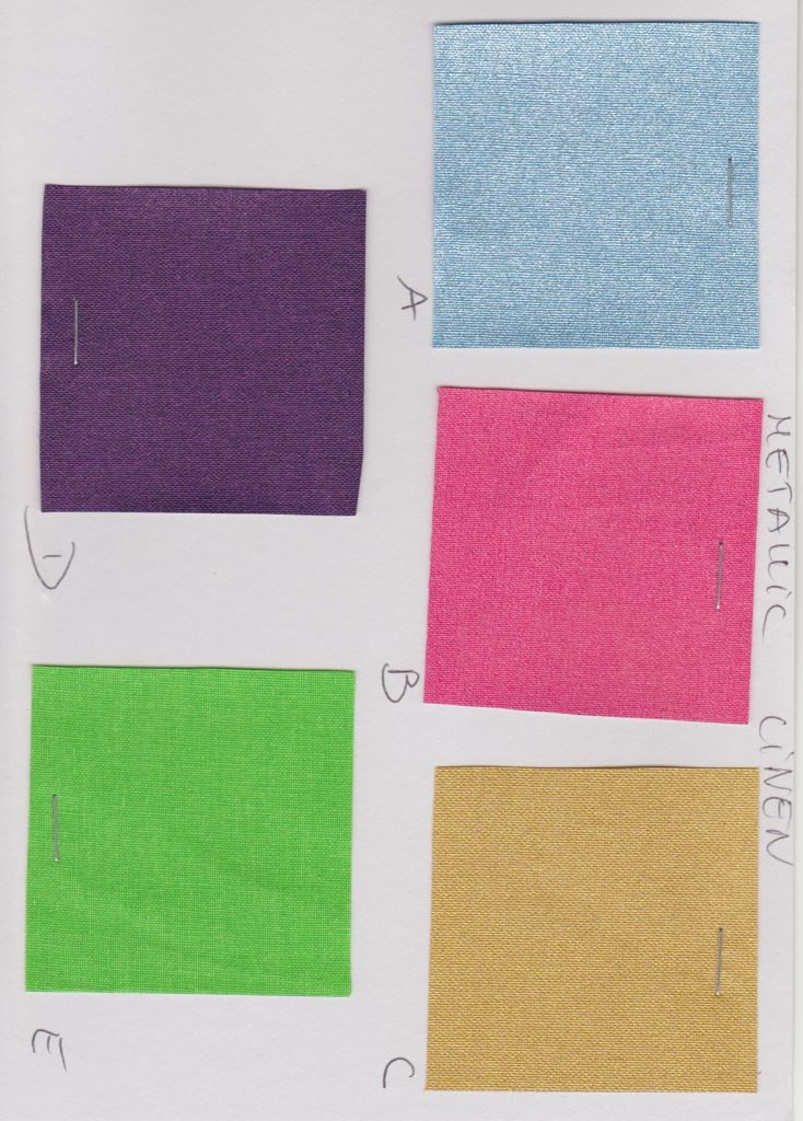
Other options considered were linen and metallics
Faux skins shortlist
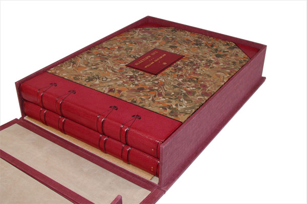
As already described the book will be an edition of 5 only, the pages being actual prints on museum quality 270 gsm paper and will be removable as per Lee Friedlanders, American Monument
Typography option in a formal placement, centred This time moving the book title to the bottom right corner, authors name running along th spine only.The author name and book title sited bottom left, this arrangement would only work if the page securing post screw heads were concealed inside the cover.
In 1977 William Eggleston released Election Eve, his first and most elaborate artist’s book, containing 100 original prints in two leatherbound volumes, housed in a linen box. It was published by Caldecot Chubb in New York in an edition of only five, and has since become Eggleston’s rarest collectible book. Although my book will not be as big as Election Eve, mine consisting of only one volume of approximately 35 prints, the essence and intention will be very much the same, to create a handmade, very limited edition artists book.
I am also very pleased Wayne Ford has agreed to write a foreword for the book, Wayne is passionate and extremely knowledgable about photography, art director for The Observer Magazine and Creative Director for Haymarket Business Media. His work has been recognised by: D&AD, Type Directors Club, Art Directors Club, Society of Publication Designers, Society of News Design, British Book Design and Production Awards, and the Periodical Publishers Association (PPA); and been featured in numerous books, periodicals and exhibitions around the world.